This apartment in Tiong Bahru is enjoying a new layout that takes full advantage of cross-ventilation and natural lighting during the day. The original walls have been torn down to incorporate the old living-dining area, two former bedrooms, and a balcony in a much bigger open space.

The old kitchen has been remodelled and updated with a worktop, sink and fittings, modern appliances, and a built-in storage for kitchen tools, tableware and accessories. The new galley kitchen serves as a conduit to the main door in front and the windows at the back of the apartment. Around the corner is a laundry area with storage cabinet and shelves, as well as worktop for sorting out laundry. The washing machine and dryer disappear into a cabinet.

Timur Designs’ Wai Kin Chan, who led the full renovation of the apartment, says that maximizing available space was key to the project. “Our client lives alone but obviously needs space for entertaining and storage, which he couldn’t obtain from the old layout.” Chan adds that the client was keen to enjoy the neighborhood’s quaint charms, hence their joint decision to retain some original elements including the kitchen tiles. “We replaced some structures with adherence to the original feel of the apartment as we modernized its ambience.”

The lone bedroom features a platform for both the bed (a queen-size mattress) and a reading nook (a loose cushion). With curtains as the only barrier between the living area and the master bedroom, it was important to design the latter as an unfussy and tidy space. Under the reading nook is a trapdoor that cleverly hides a storage for bedlinens, and flanking the bed are spaces that serve as night tables.

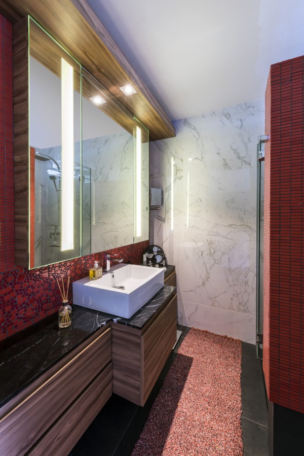
Separated by a wall that creates a through-corridor next to the bedroom is the toilet and bath. The reds and oranges that dominate the apartment are intensified in this compact space in bespoke and custom tiles. A glassed-in opening on the wall between the toilet cubicle and the shower stall is a fun, quirky touch. The entire width of the toilet is fitted with a sink and countertop, and an expansive mirror.

With virtually no dividing walls, the entire apartment is a well-coordinated assemblage of distinct spaces. A bespoke lighting system, and thoughtful arrangement of furniture and accessories have turned this apartment into a smart bachelor’s home.
This story first appeared in FORM Magazine.
The post Focus: Timur Designs’ Wai Kin Chan appeared first on LUXUO.
