by Rachel Montel
Not everyone is a designer, but our design instincts allow us the opportunity to renovate our house or apartment. Choosing color is an exciting process (and a crucial one), as color can be used as a means to represent our personality and as a predictor of our daily mood. With over 10 million colors existing today, picking what suits us and our home best can easily become a tedious task rather than an uplifting activity. Though applying color at its essence is a rather simple concept, working with a color consultant inside your home can help to alleviate that particular stressor, and bring the joy back to finding the right shade.
Equally as important is the brand of paint one chooses, not only for its quality but the brand’s focus toward less toxic and environmentally friendly colors. The best way to ensure the job isn’t done poorly is to select a brand that is durable and will hold up. (After all, there’s nothing worse than a bad paint job!) Recently, we spoke with Erica Silberman, Manager at Farrow & Ball’s Flatiron location, and over the years, she has developed a keen eye for color. Having conducted many color consultations herself, Silberman also emphasized the importance of
using a quality brand.
 Farrow & Ball has only recently been introduced in the tri-state area. John Farrow and Richard Ball introduced Farrow & Ball to the paint industry in 1946 out of the post-war era. Farrow & Ball emerged out of the hazard-conscious paint movement with the intention of creating environmentally-friendly paint. Today, most paints are acrylic-based and contain plastic, releasing toxins as they degrade. Contrarily, Farrow & Ball paints are water-based and contain an amalgam of environmentally-friendly compounds including chalk, clay, and titanium dioxide. As a result, Farrow & Ball paints provide unique features such as estate emulsions that have a sense of movement. In addition to acrylic-based paints, the brand’s wallpaper incorporates inventive and safe water-based paints, as opposed to modern wallpapers which use industrial ink on paper.
Farrow & Ball showrooms have expanded far beyond their humble beginning in Dorset, England. They now have three showrooms located in Manhattan including the Upper East Side, the Upper West Side, and Flatiron. Most recently, the brand itself has opened a new showroom in Paramus, NJ. At their new (and first) Bergen County location, the brand offers color consultations at the store and in-home. In-home consultations allow the consultant to experience the architecture and lighting of a home, two incredibly crucial variables in any design scheme.
Seeking advice from a color consultant is important for manipulation of room size and color flow consistency. Square rooms are usually preferred over rectangular rooms due to the eye-pleasing symmetry of square rooms. Nevertheless, rectangular rooms can be given the appearance of a square room by using dark colors. Fortunately, smaller spaces can also be manipulated for those desiring something larger. Silberman herself recommend using dramatic colors in small rooms, such as a dramatic color on the ceiling or wallpaper. Color flow consistency is based on one’s preference and whether they want the public space to be loud with a soft private space or vice versa.
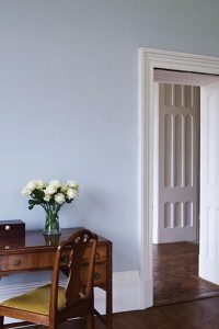
 When it comes to the latest trends, Silberman says the neutral gray trend is transitioning in order to complement the spring and summer solstices by incorporating pastels and dusty hues. These pastels will include soft pinks, greens, and blues with some bolder reds and darker blues to mimic water. During the summer, the pastel colors will become slightly bolder and then transition toward darker pastels in the fall. The fall pastels will be heavily layered with bolder tones including white for contrast.
“A white room is important in a home with a lot of color,” Silberman explained. The pastel trend mirrors the Edwardian period while dusty colors are appearing under the rise of mid-century furniture. However, with more lighting in contemporary homes the pastel trend won’t be identical to historical Victorian color schemes.
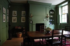
Another form of transition for the neutral gray color trend includes incorporating gray as an accent color. Accent colors will anchor the pastels as well as give rise to a sense of nature. Colors to expect include Studio Green, a dark green resembling black, Black Blue, a deep blue giving off elements of water, and Peignoir, a more masculine pink, that complements the neutrals with gray undertones. Overall, the grey neutral trend will be maintained by adding pastel and dusty colors to the pre-existing grays instead of completely replacing it. Wallpaper trends will focus on bringing nature inside the home, so expect to see floral patterns. The pastel style leaves us with yet another reason to look forward to the approaching summer months.
The post Helpful Hues: Color Efficiency & Trends appeared first on VUE magazine.
